


SkiaSharp-powered color-picker controls for .NET MAUI: an interactive color wheel, a saturation/value triangle, HSL/RGB/alpha slider stacks, and a luminance-aware composite picker. Every control is vector-drawn (no bitmaps), DPI-independent, and fully data-bindable — and any number of pickers can be linked so they stay in sync.
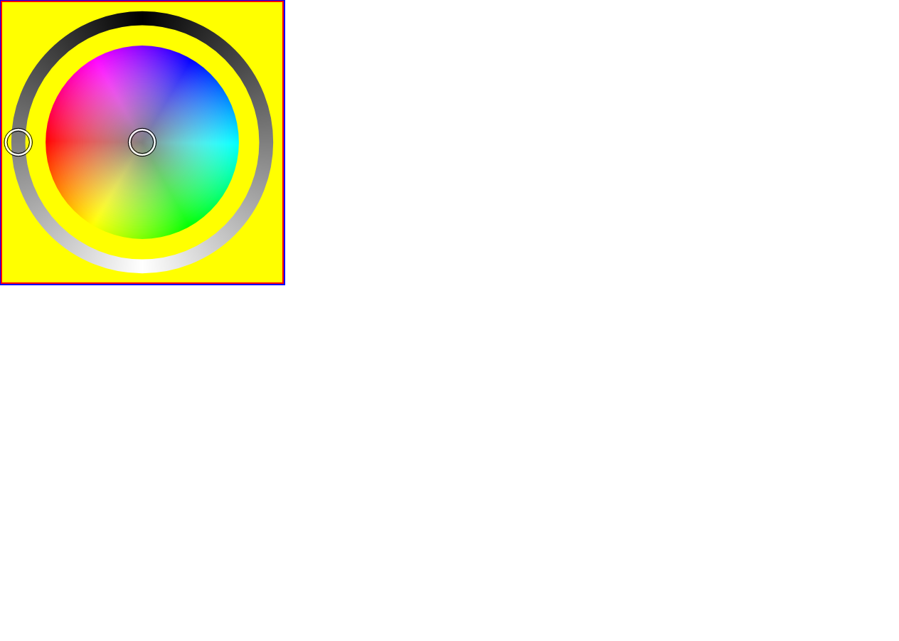
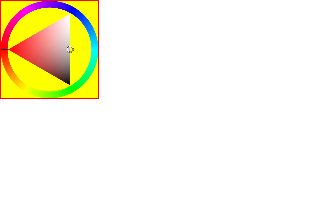
ColorWheel— hue/saturation disc with an optional luminosity ring, an optional luminosity slider, and an optional alpha slider.ColorTriangle— a saturation/value triangle that can rotate to follow the hue, with an optional alpha slider.ColorDisc— the raw hue/saturation disc (the wheel's core; usable on its own).- Sliders —
HslSlider,RgbSlider,AlphaSlider,LuminositySlider, plusDelegateSliderfor building custom single-channel sliders. - Two-way
SelectedColorbinding and aSelectedColorChangedevent. - Linked pickers — set
AttachedColorPickerand multiple controls edit the same color. - Customizable — horizontal/vertical orientation, indicator (picker-dot) size, and a canvas background color.
dotnet add package ColorPicker.MauiPreview builds are published to GitHub Packages on every push to
main; stable releases go to nuget.org.
1. Register the controls (this also wires up SkiaSharp) in MauiProgram.cs:
using ColorPicker.Classes;

public static MauiApp CreateMauiApp()
{
    var builder = MauiApp.CreateBuilder();
    builder
        .UseMauiApp<App>()
        .UseColorPickersAndSliders();   // ColorPicker + SkiaSharp

    return builder.Build();
}
2. Add a control in XAML:
<ContentPage xmlns="http://schemas.microsoft.com/dotnet/2021/maui"
             xmlns:x="http://schemas.microsoft.com/winfx/2009/xaml"
             xmlns:cp="clr-namespace:ColorPicker.Controls;assembly=ColorPicker"
             x:Class="YourApp.MainPage">

    <cp:ColorWheel SelectedColor="{Binding PickedColor, Mode=TwoWay}"
                   ShowLuminosityRing="True"
                   ShowAlphaSlider="True"
                   WidthRequest="300"
                   HeightRequest="300" />

</ContentPage>
3. …or entirely in C#:
var wheel = new ColorWheel
{
    SelectedColor      = Colors.OrangeRed,
    ShowLuminositySlider = true,
    ShowAlphaSlider    = true,
};

wheel.SelectedColorChanged += (s, e) =>
Console.WriteLine($"{e.OldColor} -> {e.NewColor}");All pickers derive from ColorPickerBase and share these members:
| Member | Type | Default | Description |
|---|---|---|---|
SelectedColor |
Color |
HSL(0, 0, 0.5) (mid-gray) |
The current color. Bindable, two-way. |
AttachedColorPicker |
IColorPicker |
null |
Another picker to keep in sync with this one. |
SelectedColorChanged |
event |
— | Raised on change; args expose OldColor / NewColor. |
| Property | Type | Default | Description |
|---|---|---|---|
ShowLuminosityRing |
bool |
true |
Draw the luminosity ring around the disc. |
ShowLuminositySlider |
bool |
false |
Add a separate luminosity slider. |
ShowAlphaSlider |
bool |
false |
Add an alpha (opacity) slider. |
Vertical |
bool |
false |
Place attached sliders beside the wheel instead of below it. |
CanvasBackgroundColor |
Color |
Transparent |
Fill drawn behind the wheel. |
IndicatorRadiusScale |
float |
0.05 |
Picker-dot radius as a fraction of the canvas. |
| Property | Type | Default | Description |
|---|---|---|---|
RotateTriangleByHue |
bool |
true |
Rotate the S/V triangle so its hue corner follows the selected hue. |
ShowAlphaSlider |
bool |
false |
Add an alpha (opacity) slider. |
Vertical |
bool |
false |
Place the alpha slider beside the triangle instead of below it. |
CanvasBackgroundColor |
Color |
Transparent |
Fill drawn behind the triangle. |
IndicatorRadiusScale |
float |
0.035 |
Picker-dot radius as a fraction of the canvas. |
Set AttachedColorPicker to mirror the color between two (or more) controls — edit either
one and both update:
<VerticalStackLayout>
    <cp:ColorWheel    x:Name="Wheel" />
    <cp:ColorTriangle AttachedColorPicker="{x:Reference Wheel}" />
    <cp:RgbSlider     AttachedColorPicker="{x:Reference Wheel}" />
</VerticalStackLayout>Built for .NET 10 / .NET MAUI 10 — net10.0-android, net10.0-ios,
net10.0-maccatalyst, and net10.0-windows — with SkiaSharp 4.x.
# Requires the .NET 10 SDK (pinned in global.json) + the MAUI workloads.
dotnet build ColorPicker/ColorPicker.csproj -c Release -f net10.0-windows10.0.19041.0
See AGENTS.md for the full toolchain, CI layout, and net10 build notes, and
ColorPickerTestApp for a runnable sample that exercises every control.
MIT © Victor Papenko